Friday, August 24, 2007

For Your Consideration


promotional poster for No Time for Nuts © Blue Sky

Damn this is good, but is it the pinnacle of animation? Oh boy, here I go again, stirring up trouble on the subject of animated shorts from big, successful studios. At least I am back to talking about poses and how they can be pushed.

Well? Really! I must say! I post my thoughts about a double pose found in a still from an animated short from Blur and I get three times as many replies... and that's if you don't count the personal emails, online chat, and phone conversations. What is it with my readers? Apparently, you people only like controversy. ;) Ok, so I posted a critique of A Gentleman's Duel that wasn't written from the vantage point of a geeky, devoted, 'fan-boy' in that it was actually... um.... critical. Oh my. Just consider the source and get over it!


Still image from No Time for Nuts © Blue Sky (click to enlarge)

Ok, everybody likes a little drama now and then. That's a lot of what is behind good stories... drama. Or comedy, for that matter. In fact, in traditional Greek theater comedy meant a happy outcome and tragedy meant a sad outcome. By that standard, No Time For Nuts would be a tragedy. I'm going to go out on a limb here and call this animated short a comedy. A superbly crafted, entertaining, and beautifully executed comedy. If you have watched the original Ice Age movie, then you know the motivations of the main character of No Time For Nuts. Based on prior history watching Scrat struggle through the challenges of an 'Ice Age' planet you can identify with him in a big way.

That is a valuable starting point for any story teller. Scrat is a memorable character outside of any particular story that focuses on him.


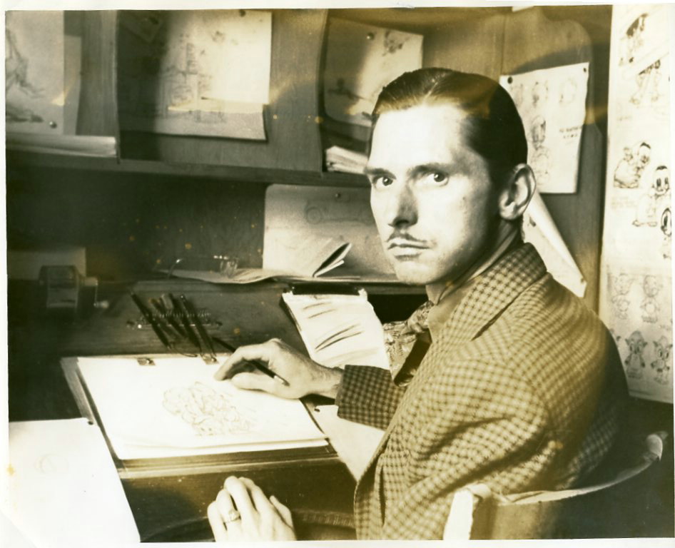
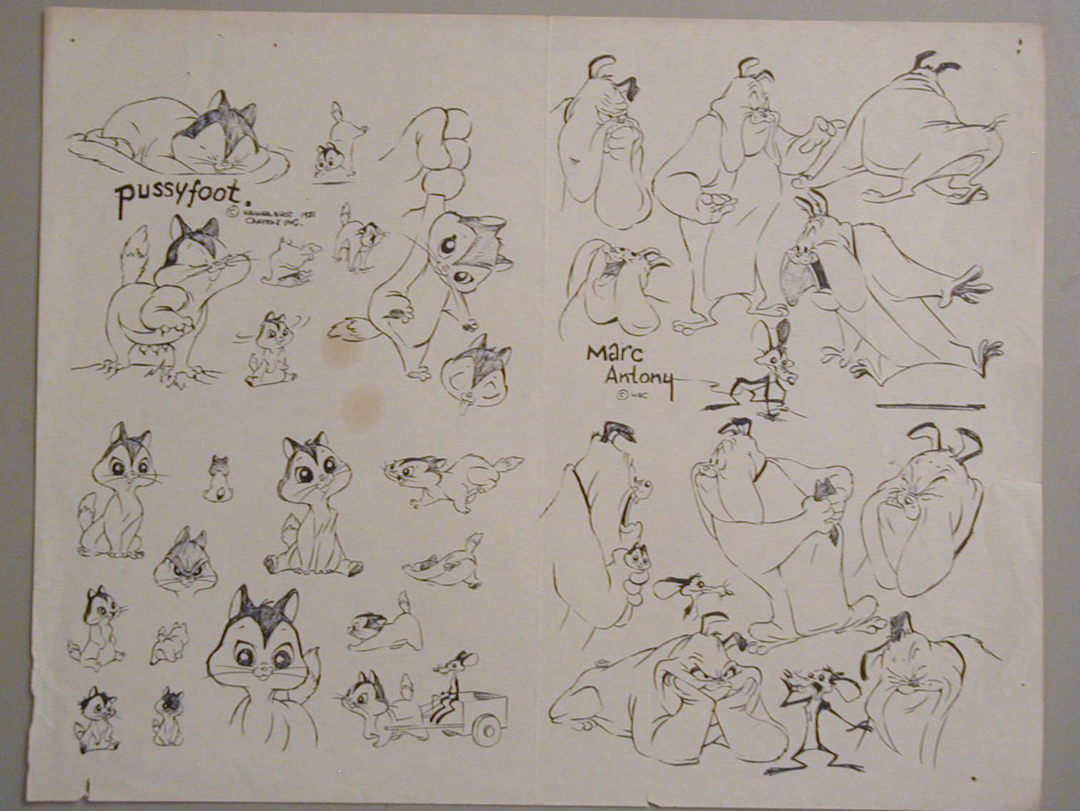
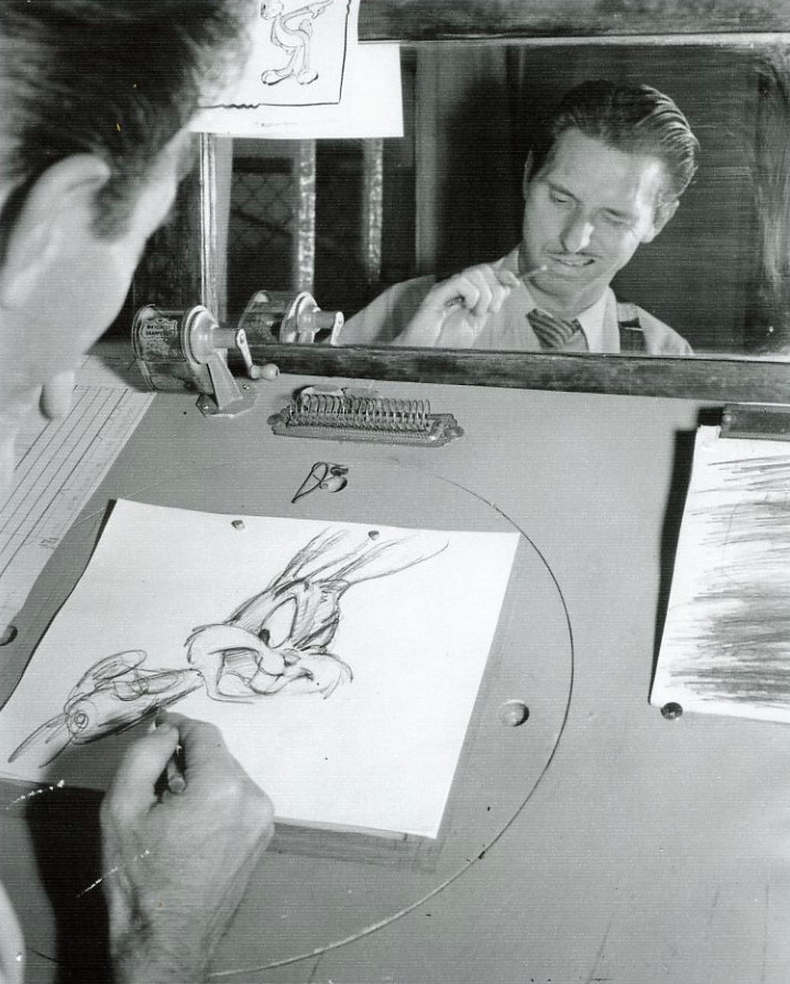
On a similar note, Chuck Jones was responsible for creating many memorable characters during his career. We enjoy the many, many animated shorts he directed because we know who the various characters are over the history of these Warner Brothers animated shorts. The reality of Jones' characters: Pepe le Pew, Road Runner & Wile E. Coyote, Tasmanian Devil not to mention how other pre-existing characters such as Bugs Bunny, Elmer Fud, and Daffy Duck all found an individual voice, unique to each, under the direction of Chuck Jones. Audience expectations play a critical part in how these Warner Brothers characters entertain and how the stories created with them have a life outside of any particular animated short.

From a marketing stand point, they are a highly valuable properties outside of any particular animated production. The same is true for Scrat. We know his motivations and state of mind and he exists as a character in spite of any particular production or story. This is meaty stuff for any good writer and the creators of No Time for Nuts take full advantage of the story potential provided by Scrat. Watching the short you see a masterful use of tempo as the main character is rapidly zapped from one reality to another, each setting up a gag of positioning Scrat at the pinnacle of impending doom. In each case, his only way out is the same way he got there in the first place... by randomly hitting buttons on the time machine found in 20,000 B.C.

The gags work on many levels making each more enjoyable than the last. Not only is Scrat whipped through a series of dangerous scenarios, each more deadly than the last, but the first half dozen or so are references to other films including one blatant plug for the original Ice Age film. You can get the inside jokes or not, either way its funny. Which brings me to the next image...


Still image from No Time for Nuts © Blue Sky (click to *ehem*, enlarge)

Its a pretty funny gag, particularly when you see it as originally edited in sequence. The transportation of Scrat through time and location reaches a furious pace pausing only at this moment seen above in the Galleria dell'Accademia, Florence Italy [thanks to Kate for the correction]. The exasperated Scrat exhales emphasizing the hilarity of the double entendre. You can get the joke... or not. The joke is not critical to the story, nor does the joke distract from the story. The creative people who crafted this juxtaposition can claim that they are only showing the main character in a location that is easy to identify historically. Any baser meanings perceived by viewers are simply in their own dirty, little heads. (*wink wink*)

This is the kind of adult entertainment found in movies prior to the toppling of the Production Code in 1967, and that is sorely lacking just about everywhere else today.

So, is this high art deserving of the highest honors? Apparently the Academy thinks not, instead giving Torill Kove top honors in 2006 for The Danish Poet. Extremely well written, directed, and produced, No Time for Nuts did receive a 2006 Annie Award for "best animated short subject." Directed by Chris Renaud and Michael Thurmeier, No Time for Nuts may not be the pinnacle of animation today, but it is up there, honoring the Termite Terrace shorts from which it draws so much inspiration.

Here is a link to the official site for No Time For Nuts at Blue Sky.

-e

Saturday, August 18, 2007

Crack Spiders and Such

Warning: At the risk spoilage, there is some colorful use of "street language" towards the end, so don't watch if easily offended. Brought to you courtesy of Tonymation.


I'm sorry but this was/is just too funny not to post. I love the hammock and the restraining order... especially the restraining order.

I promise to get back on topic soon.

-e

Friday, August 17, 2007

I/O Brush redux


Well, my last post was a little off topic so I thought bring it back to character animation gradually. So, lets first lest get things back on the ground by revisiting the I/O Brush. My prior post on this was kindly provided by a friend Marx Myth. This time I don't know who to thank for this link... other than the creators of this concept.

This kind of crazy ''technology-meets-wouldn't-it-be-cool-if' thinking is what I have come expect from The Media Lab at MIT. Its nice to find out a little regarding who is behind the project. Trust me when I say that not every Media Lab project gets off the ground, but this one could have legs if they can figure out what the killer app for it will be.

As always, enjoy.

-e

Sunday, August 12, 2007

Visual Effects


Ok, more than just a little off-topic from character animation but I have to say, this just looks too good to be true. Supposedly video taped in Haiti on August 6, 2007 this clip popped up on You Tube and has gotten a lot of attention.

Approaching this as a creative project there is some nice work with color correction, lighting, and things going out of focus and then back in again. I like the design of the craft, very atypical for this kind of thing. The original camera work provides a good foundation. Camera shake is a great way to sell this kind of effect because with proper tracking it locks elements together in the frame while making the footage seem gritty and real. Trace this back to You Tube and you will find a lot of mediocre to poor attempts at faking unidentified flying objects. This clip and the one embedded below stand out from the bunch.

Not only is the image quality great but the sound is almost perfect. And that's just it. This is the key element that makes me suspicious as to the authenticity of this video is (well, ok other than the subject, but really) the sound. What every film maker should know is that sound can absolutely sell the reality/believability of animation and film. The fly-over has a wonderfully subtle Doppler effect. The sound of a woman gasping in the beginning creates a lot of value towards its authenticity. But where is the rattle and scuffle of that comes from a microphone that is embedded in or connected to the camera. There is a little of this but it just seems too clean to me.

Or, is someone going to tell me that the image and sound quality is about right for consumer hand-held digital video equipment?

Whoever is responsible for this did a nice job with the concept. For instance, I like the orchestrated pattern of craft at the very end... as if the flight pattern and arrangement is some kind of visual message to us earthlings. It reminds me of the pattern in a swimming pool waves make after they bounce off the sides and meet in the middle. Creatively, its a very nice touch.

It would seem that someone in the neighboring country of the Dominican Republic had the same equipment for capturing this kind of event, apparently on the same date, at the same time of day, on the same kind of shore-line, and facing the same compass direction as the first example. Here is the same craft as "seen" with others, supposedly on the same date in a different location.


Strange coincidence, ay? Beautiful visual effects.

Then again, you never know.

-e

Friday, August 10, 2007

Dry Erase Power


The pen is mightier that what? Oh.

Whatever.

I'm just having too much fun watching this playful stream of consciousness go to work. Thought others might too.

Thanks goes out to David Walden for having this You Tube link hanging around on his blog.

I like to find out about the people who create things that I enjoy, so I found it a little frustrating when trying track down the source of this work. The artwork was created by someone who's other cool works are to be found at the vaguely identified blog of ljudbilden & piloten. I guess thats first initial followed by last name. Who knows? No profile is available as far as I can tell. Don't ask me why some artists want to stay semi-anonymous by positioning themselves behind handles, cryptic ids, and/or pseudonyms.

Whatever.

The animation was created as a music video for minilogue. That would be Sebastian Mullaert and Marcus Henriksson.

Follow the links for ljudbilden & piloten if you like the visuals. Follow the links to minilogue if you like the sounds. Enjoy.

-e

Sunday, August 5, 2007

Poses Pushed A Little Too Far


A Gentlemen's Duel image © Blur (click to enlarge)

(Warning: a sexually suggestive image is at the bottom of this post)

NOTE: August 21, 2007... Compared to other items found on this blog, there has been a lot of reaction to this post. Some I care to speak of... some I don't. Everything in this post is intended to be thoughts and opinions expressed for constructive purposes. As with any opinion expressed publicly, not everyone agrees. All I can offer before anyone gets bent out of shape is to consider the source. I have made a few minor adjustments to the original post because of source files no longer being available, and to fix two little typos. The gist of this article is essentially the same as originally posted.

When teaching animation I tell my students to observe the work of others and learn. I show them stills from various animations, great and small, and I point out all the tools being used by skilled artists who know how to create inspiring, appealing, and life-like performances on screen. As with all things that I teach, I tell my students to do what I do as well. Which brings me to the images you see in this post... and the name of this blog.

Poses are fundamentally important to how I understand character animation. The performance is in the pose. No amount of fancy pants spline tweaking, blur frames, or what-have-you can make up for poses that fail to communicate who a character is and what that character is driven to do internally by intentions, attitudes, and emotions. We understand the inside of the character by what we can read on the outside... the pose. To push a pose (as I understand the phrase) is to find the essence of a character performance by exaggerating those qualities of the pose that communicate what the performance is all about. Getting at the essence of what I understand about animation is partly why I came up with the name for this blog.


A Gentlemen's Duel image © Blur


As with anything in art, you can take something too far.

The expertly staged, nicely composed, and beautifully lit stills you see in this post are from A Gentlemen's Duel which was recently created by Blur. Blur Studio is very unique production house with some fantastic work to their credits. Like Pixar, Blur is one of the few CG shops that consistently puts out animated shorts. As is to be expected, A Gentlemen’s Duel is a beautiful production that is very well animated.

NOTE: August 21, 2007... the YouTube link originally found here was pulled (as it probably should have been.) You will not find it on Dailymotion either. To see the entire short check out Stash 32. Below is a still that matches the original YouTube rip. Click image to see Blur's trailer.


A Gentlemen's Duel image © Blur
(click to jump to Blur's website)

Yesterday, I surfed over to Angie Jones' blog Thinking Animation and I noticed that one of her recent posts was both applauding and criticizing A Gentlemen's Duel. The negatives she summed it up as reasons for dissatisfaction and feeling insulted were probably a by-product of her not having a Y chromosome.

Well, I have that particular chromosome and I wasn't entirely thrilled with this latest Blur short either. To sum it up, I am not a fan of humor that requires the audience to turn off empathy towards a character. In general, I don't like jokes that are "funny" because a male character keeps getting nailed in the nuts... and I don't like jokes playing off a lack of concern for a female character's well being, so much so tha
t she is beaten, punched, smacked, knocked over, and hit on the head with a broken stone planter. I also don't find a story funny just because ample bosoms giggle on female character who is generously endowed.

While well endowed women are a wonderful site to behold, and the way certain areas of their anatomies giggle can be a delightful experience for many of us humans - for me, it would help if a female character in a story where, oh... I don't know... in possession of a brain, some wit, and her own agenda that may happen to be separate from that of men. Some of us Y chromosome people find such qualities in women attractive, and dare I say it... appealing.

Good grief, the toy poodle has more personality than the female character around which so much of the plot revolves.

Angie Jone's post regarding this short reminded me of a rendered still of the production I found online in November of 2006. With this image I made a few discoveries that, atypical for me, I haven't bothered sharing with my students.


A Gentlemen's Duel image © Blur (click to enlarge)

One thing I try, desperately, to get across to my animation students is how all elements in the frame are connected. Which leads me to the still you see directly above this paragraph. If two characters are on the screen at the
same time they have a relationship, and that relationship is communicated with all the tools great animators developed oh-so-many-decades in the past... staging, silhouette, line-of-action, contrast, asymmetry, eye-line, competing angles, flow-lines... flow-lines are big. Ask any of my students; I never shut up about flow-lines. With that in mind, what is with the male character's arms and hands in this image? He isn't just gesturing, and he isn't just positioning the chair for the female character to sit in... what is he doing with his hands?

His hands are all wrong. The flow is wrong. They have been pushed too far. But first lets look at his eyes and his crotch. Oh goodie.


Ok, so in part the joke behind this animated short is two "gentlemen" (who are nothing of the kind) are competing for the attention of the female character. The attitude and intension of this particular male character is pretty well summed up in how his eyes are positioned towards the female character's backside and how his crotch is protruding forward unnaturally. I'm no prude, I get the joke and I can find this kind of humor enjoyable if it is done well. What stood out to me when I first found this image in November was that all kinds of elements of his pose where pushed too far. Probably on purpose. But why?

When analyzing this image I noticed that the silhouettes of the two characters create an outline that is almost in the shape of a heart. Ok, kind of clever, but why? The male is only one of two rivals for the female character's affections. Her eye-line seems to match his and keeps the viewer moving back to the male character. But her arm, although natural, had a strange correspondence with the male characters left hand.


Then I noticed the strange posture of the male character's right hand seemed to have a strange correspondence with her neck, right shoulder, and breast. So, I pulled out my old image manipulation and compositing skills and did a little Photoshop work to test the theory that was developing. And sure enough...


(click to enlarge)

What the heck?! A subliminal suggestion? That is somewhat pornographic in nature? Again... why?

For the record, all I did in Photoshop was slide one character closer to the other and layer the male character's fingers appropriately. The "relationship" on screen between these two characters is no accident.
I would not be surprised to find more cleverly disguised messages in the staging. In my opinion this type of artwork, and the ideas behind it, derives from the preoccupations of adolescent boys. I'm not so prudish as to be offended, but I am mature enough to wonder why Blur, a great creative production studio, would stoop down to this kind of juvenile silliness.

Maybe someone else can help me understand why this animated short is so contorted around sexual innuendo as if we haven't had that kind of thing before. Farce, sexual or otherwise, can be a wonderfully entertaining experience for the audience but only if it has been created by masters of the genre.

Sorry folks at Blur, in this particular case, I'm not seeing the brilliance of your previous animated short productions. There is brilliance in the lighting, character designs, models, the technical accomplishments for sure, and yes... the layout. But the brilliance on full display in all these areas isn't finding it's way into a story.

-e

Wednesday, August 1, 2007

Neglect


image "borrowed" from this photo log created by someone named Jeff.


It's only been since Friday that I posted most recently and yet I feel as though I have neglected this blog. Strange.

I've been spending way too much time hanging out on other people's blogs, making a complete and utter nuisance of myself... opinionatedness all over the place. Soon there will be installment two of Beautiful Silhouettes and I have several other posts in the works.

In the meantime for you fellow history lovers check out:

Beautiful Silhouettes, part 1 regarding the early work of Lotte Reiniger.

Or check out the small but fascinating online archive of Ken Harris' work.

Or take a trip in the way-back-machine to watch a cool sample of Buster Keaton's work and read some thoughts on learning from this master of movement and performance.

For those of you curious about my work:

We have glacial movement in my acting performance work.

Some performance improvement through a good critique that forces the issue of timing and spacing.

Some animation tests geared towards what I teach.

And completion of my second animation test for the same.

Or just some life drawing examples from this spring.


And definitely check out this awesome "video" tutorial on the meaning of COPYRIGHT and fair use put together by Eric Faden.


All of my commenting on other peoples blogs seems to be driving more people to this location. I'm getting hits from places like Brazil, England, Germany, France, India, Romania, Australia, New Zealand, Chile, and Japan just to name a few. Thank you to everyone who bothers to stop by and check out this spot. Very flattering to think in what distant locations my musing are traveling. Stay tuned. I have plenty more to come including more samples of my own work current and past.

-e

Friday, July 27, 2007

A Mantra for Independent Animators

I was in Tucson, AZ in June hanging out with one of my mentors and the chair of my graduate thesis committee... Becky Wible-Searles. Becky is an accomplished artist, poet, animator, and director. She had her own animation studio in NY city for some 14 years and has taught her subject for a number of years in New York, Savannah, GA and now, Tucson, AZ. She is also a lot of fun to hang out with, as is her husband Jimmy. During my visit she described a problem dealing with a talented student who was having difficulty getting his final project over the finish line. Becky is the absolute master of getting it done. She told this young student of hers an elegant mantra to chant...

SIMPLE. GOOD. DONE.

Powerful words for any self respecting animator and/or artist to live by.

So, I've been lurking around on Keith Lango's blog a lot lately... doing my best to make a total nuisance of myself. One item that I mentioned in a comment to part 2 of Keith's The Fool's Errand series caught his attention. That item was Becky's mantra.

Later in part three of the series Keith mentioned that independent animated short production should probably be fast and fun. So, I just put the two ideas together and got SIMPLE, GOOD, FAST, FUN, DONE. It sounded okay, although not as good as the original... not as basic... but, it had flavor. FUN was the critical part that seemed to be improving the formula.

Well, I spent some time with the phrase today and decided to remove the "fast" part of the mantra. SIMPLE, GOOD, FUN, DONE. Seems to work better. Even more so if I put FUN before GOOD. Sounds good because it has a nice Rhythm.

Pulling from my print production and graphic design background I created a poster with this phase. I like the way my typographical layout makes FUN larger than the other words. Included with this post is a link to a PDF I created that gives you a tabloid (11in x 17in) poster of the image below.


Click the image or the link above to download the attached PDF. Print it and use it in good health. Credit Becky Wible-Searles and Keith Lango for its intellectual impact.

Credit me only for the graphical layout.

-e

Test Jump


Well, I've done a little polishing on my test jump exercise using the 'aniBody' rig with which I've been tinkering. The movement is about as good as it is going to get considering that I'm using a bare-bones FK Spine setup. The arcs are working to my satisfaction and I have developed all the required elements of anticipation, action, reaction with a minimum of effort. It is no great achievement for the art of animation... just an exercise.

If I am proud of anything it is how quickly this came together and how well organized the work has been while it progressed. Accept of my students, I won't bother anyone with what the Dope Sheet editor or the Graph Editor look like for this example but it is something worth geeking out over for you Maya users. Very clean and organized.

Speaking of organized keyframe animation...


On the subject of process/technology versus art/animation there has been a great series of articles posted by Keith Lango. Check out The Fool's Errand, part 1, The Fool's Errand, part 2, The Fool's Errand, part 3. In this series Lango describes in heart breaking detail an ill-fated adventure he took into producing a personal animated short. Lots of great discussion in the comments as well.

Ok, that's it for now. Lot's of big, scary stuff to get started on.

-e

Sunday, July 22, 2007

Beautiful Silhouettes, part 1


Most animators understand the importance of a strong silhouette, but how many push this concept to the point of creating a beautiful silhouette? As the image above from the 1926 animated feature film The Adventures of Prince Achmed by Lotte Reiniger demonstrates there is tremendous aesthetic potential in the silhouette. By the way, I did type that correctly, 1926, animated feature film, not by Walt Disney, but instead directed by a woman (*gasp*), some eleven years before Disney created the "first" feature length animation Snow White and the Seven Dwarfs in 1937.

I suggest that you sit for a moment and consider the cognitive dissonance in that last sentence... I'll wait.

Lotte Reiniger was inspired by the beauty of traditional Chinese and Balinese shadow plays. Just look at the beauty of these images from The Adventures of Prince Achmed or as it was originally titled in German Die Abenteuer des Prinzen Achmed:


Her use of color which preceded technologies such as Technicolor is both simple an appealing. Notice the subtle details in the backgrounds of the images above. Animated in stop motion using paper cut-outs and captured in multiple planes, she managed to create a sense of depth throughout the film. Reiniger worked primarily with the help of her husband Carl Koch long before standard tools and techniques and were established.

For those who are interested here is a link to download an rather nicely constructed PDF press kit created by Carl R. Pidhagny, © 2001 Milestone Film & Video.

The PDF includes an essay titled "Scissors Make Films" by Lotte Reiniger herself explaining the making of the film, her synopsis of the story, as well as background history compiled by others on how Lotte and Carl invented the process necessary to make this production possible. For additional history about Lotte and Carl see this article at AWN written by William Moritz.

This beautiful film as well as a historical documentary about the director and her work are available on DVD. For those who believe in animation as an art form having rich aesthetic potential for telling stories, this is well worth the investment. Its also a fascinating slice of the history and development of animation.


The Adventures of Price Achmed DVD © 2001 Milestone Film & Video

Reiniger's work has inspired the animation of others who have followed her wake such as Michel Ocelot. Check back to see part 2 of this subject on animation aesthetics influenced by traditional Chinese and Balinese shadow plays, and the beauty of artful silhouettes.

-e

Ken Harris: Master Animator


I just found this very aptly named website dedicated to the career and work of Ken Harris. The URL 'masteranimator' pretty much says it all. Best known for his work with Chuck Jones while at Warner Bros., Ken also worked on various projects for Hannah Barbera, MGM, and later worked with Chuck Jones again on the classic animated production of How the Grinch Stole Christmas! after Jones "left" Warner Bros.

In the middle there somewhere is time that Ken Harris spent working for Richard Williams on such projects as the title sequences for Return of the Pink Panther, Williams' animated production of Scrooge, and the mysterious and storied Williams feature production The Thief and the Cobbler. There are lots of little goodies to be found including cycles from Thief animated by Harris, and models sheets from various productions including some for the characters Pussyfoot and Marc Antony from the 1951 classic Feed the Kitty.


click to enlarge

I find his time working with Williams particularly meaningful since some of the the tutelage that Harris offered Williams and others at Williams' animation studio ended up inside the Williams' animation how-to The Animator's Survival Kit.

While the layout of the site is bare-bones and very basic, there are a lot of wonderful nuggets of animation greatness to be found. Special thanks to Animation Mentor student Jeff Weidner for having the link included on his blog. Also, while googling stuff for this post I came across Kevin Lanley's blog Cartoons, Models Sheets, & Stuff which has many, many samples of great stuff from the past, so check it out.

Wow this post is turning into a real link-o-rama so I'll just rap it up on a good, solid note...


The quote found on the front page of www.masteranimator.com much sums it up:

"He was a master animator, a virtuoso... Ken Harris did it all."
- Chuck Jones

And we are all the richer for his contribution.

-e

Wednesday, July 18, 2007

Cool? Yes. But, will it blend?

Sure, the iPhone is sleek, beautiful, a cool to play with... but:


Who knew that the iPhone had such remarkable additional qualities. Wow, those boys and girls at Apple must think of every contingency. I have to say that blender is definitely up to the task. Frighteningly so. For those interested in seeing what else 'blends' there is an entire website devoted to the subject:

Will It Blend?

I was surfing through blogs by way of Halcyon Realms when I came across the above YouTube link. It took a little surfing but I found Zero had a link to the geeky IT mag GameAxis. Yeah, that's how I found it. I need to get a life, or just start acting like I have one.

Halcyon Realms is a beautiful blog by-the-way. Vong Yungchow is quite the talented and accomplished artist who seems to attract attention from a lot of other interesting people. Here is a photographer I found thanks to posts and comments at Halcyon Realms:

Laurie Jackson:
Parallel Universe and Capture This

Enjoy.

-e

Tuesday, July 17, 2007

I/O brush

Get a load of this.


Just load it up and go.

Watching this video I find it just as fun seeing how the various sources for the "paint" program react to being sampled.

A special thanks goes to Marx Myth for the YouTube link.

-e

Saturday, July 14, 2007

Rigging Anybody?

I have been working on a template character for teaching the fundamentals of rigging *and* the fundamentals of animation in a course I'm likely to be teaching this fall. I don't yet know how much I'm going to need to cover in terms of basics, although I'm pretty certain that these students know at least a little about animation. More on that later.

Here is the segmented version of the character. I call him/her/it aniBody.


aniBody borrows some important concepts from other rigs designed for teaching students the fundamentals of animation. Primarily, I am pulling from the folks at Animation Mentor who provide their students with 1) a bouncing ball w/tail rig named Taylor 2) a walking-ball rig, 3) a segmented character named Stewie, as well as 4) a high-res Stewie setup which is a complete single mesh character.

Animation Mentor is an 'animation only' online school that is pretty much kicking asses and taking names on the subject of teaching character animation. Any college program of animation instruction that does not pay close attention to what Animation Mentor teaches is most likely cheating their students and probably headed for folly. But, like I stated, they teach character animation only (which is a lot) but nothing else that relates to the subject of character animation.

In my personal opinion, the majority of college programs teaching in animation should not be 'animation only' in their curriculum. If they were, who would write stories? board said stories? design characters? model and texture said characters? rig said characters? model environments? texture and light said environments? create special effects? render? composite? and so on... ?

...you get my point. Animation Mentor absolutely depends on there being other types of schools out there that are more comprehensive in terms of curriculum. AM graduates would have nothing to animate if it weren't for the other animation programs out there.

But, getting back to the subject... aniBody.

The design of aniBody uses some of the ideas behind setups such as those provided by Animation Mentor with a few basic differences; 1) aniBody is intended to serve as a basic model for learning rigging as well 2) aniBody is intended to be rigged and animated in stages: first hips/legs as in walking ball, then add spine/head, and finally entire character including face arms and hands 3) aniBody does not have cartoony proportions exaggerated such as Stewie's scary, over sized eyeballs and 4) aniBody is designed so that students can swap out the original head with their own designs if they choose to do so at a later time.

Rigging can be very tedious and unrewarding process for students who are not inclined to pursue the subject further. This character rig-and-animate approach is intended to give all students quicker rewards by allowing them to animate between stages of rigging. It is also designed to introduce the complexities of animating in gradual increments. A full-on character animation class (or two, or three, or... ) should follow with no time spent on such technical matters.

I do what I teach pure-and-simple. If I teach others to rig, I rig. If I teach others to animate... its because I animate. Anyone pushing the idiotic thesis that those who can do, and those who can't teach is itching for a ugly encounter with me.

You can't teach others what you don't do... therefore, I do and I teach.

Below are a few of my resent test run-thrus for rigging *and* animating. First, the hips/legs setup with a generic walk-cycle:


click to play

It's basic and it works. And then after rigging the spine, neck, and head I created a simple jump exercise:


click to play

The animation above is only in a rough-blocking stage... currently this sequence is in linear tangents (for those who care) and has been animated primarily on '2s'. With only a few hours in creation it still needs work, but I'll polish this one later. Meanwhile something funny happened when preparing this for my blog.

For those who think people familiar with the complexities of 3D rigging are lacking in artistic sensibilities, here is something that spawned from the creation of this post. While rendering the stills above with a little After Effects trickery I noticed something familiar. The still for my generic walk-cycle looked like Nude Descending a Staircase, No. 2 by Marcel Duchamp.


And then I noticed that my jump exercise vaguely resembled the effect used by the masterful experimental animator Norman McLaren in his work Pas de Deux. Along with George Dunning and Grant Munro, the work of Norman McLaren has served as inspiration to me in the past so I decided to render out what I had. Its not brilliant, but it gives me ideas.


click to play

In the mean time, for those who mistake art for not knowing how to make things work, watch what a truly masterful command of technical matters can produce.


I know, it looks more like film making and compositing than it does animation. First of all, animation is film making; and second of all, there was a time before contemporary digital compositing techniques when this kind of work easily fit in the category of experimental animation. Besides, aren't contemporary, digital compositors working primarily in the animation industry?

Hope you find this as amazing as do I. Meanwhile I'm going to continue working on my rigging so that I have a complete version of aniBody for the next test animation.

-e

Friday, July 13, 2007

A How-To...

by Keri Smith.


Boy, do I identify with #2. Yeah. Yep.

If you like that one - the how-to - then scoot on over to Keri Smiths illustration website and check out her "play" section. There is indeed some fun stuff to be found.

Enjoy.

-e

Friday, June 29, 2007

What the heck is...

copyright?


Okay, this is just too cool for words. Others have linked to this in the past. I just think it needs to be celebrated as much as possible.

And for that matter... what the heck is fair use?

Good question.

Well... its not a right, but a legal defensible position.

Anyone (like me) who has had their creative work credited to another or who (like me) wants to share the creative work of others without harming the original author, will find this informative if not useful. More importantly, if (like me) you are concerned that the coercive influence of corporate America is eroding the foundation of creative copyright for reasons that have nothing to do with protecting the intellectual property of the inventive individual... then I present to you an argument crafted by Eric Faden. Enjoy.

-e

Punch, Steal, Death

Online Dating

According to the website Mingle2, this rating was determined based on the presence of the following words found sprinkled throughout my blog:
  • punch (4x)
  • steal (3x)
  • death (1x)
While the rating seems about right the words that were found make me wonder what is up with me.

BTW: I found this thanks to Jean-Denis Haas at swench.blogspot.com Click on the image above if you would like to get one of your own.

-e

Sunday, June 24, 2007

Holy Cow! 4012!


Four-thousand and twelve. That's a nice set of flip books to have in one collection. I love it when people are inspired to collect and preserve a slice of the past for the rest of us to gawk at. Animation is typically an labor intensive, expensive, and time consuming art form. The closest thing to an exception to this rule is the flip book (or flick book). Take a look at this site on the subject:

http://www.flipbook.info/index_en.php

Predominantly written in French, above is a link to the English home page. More fun than a pile of books documenting the work of Eadweard Muybridge.

I've been touring one corner of the great south-western USA. Plenty more posts to come on that subject and many others.

-e

Saturday, June 2, 2007

Stealing Time for Life Drawing


In March of 2004 I had the distinct pleasure of attending a figure drawing seminar taught by Glenn Vilppu. My participation was a bit surreptitious since I wasn't on the list of students invited to attend, but then asking for forgiveness instead of permission has worked well for me in the past, and it did so on this occasion as well. At the time I had finished my graduate studies and was working full-time in computer support while completing my MFA thesis. With all the technical responsibilities I was under pressure to meet every day, having a little creative time while learning from one of the best seemed like an opportunity that shouldn't be missed. "Feel the flow... feel the flow," was the catch phrase throughout the seminar.

I've been drawing the human figure from life off and on since the beginning of my undergraduate studies in 1983, and that's if you don't count the clothed figure drawing my high-school instructor had us do. So, I was feeling quite in my element during these drawing sessions, except for when it comes to that extra critical eye walking around the room. But then, that's why I sneaked into these drawings sessions in the first place. When he finally got around to me during one session Glenn noticed that I seemed to 'feel the flow' but that my drawings all 'lacked form'.


He then proceeded to demonstrate what he meant by this on a page of my sketch pad. The two examples above that appear as if they were drawn by an old master, were. These are demonstrating "form" on the left and measurement and rhythm on the right. Each drawing took only a few minutes and flowed out with amazing ease as his hand moves in what appeared to be a very graceful slow motion. I realized from that moment, no matter how comfortable I felt about my drawing abilities, that I needed to learn to draw all over again. Since that time its been a struggle to find time for developing my skills in this area but I manage to keep trudging forward. Below are some more resent examples of my effort.


Above are some 3-minute poses from the first sessions I had been to in almost a year and a half. Some flow but not much form. Still working on building the figure from the inside out. I seem to struggle a bit when the poses are long since I have time to think about what I am doing instead of just doing it. Below I took one 20-minute pose and broke it up into three drawings. Keeping the amount of time I spend on a drawing to minimum seems to help me stay focused, and repetition never hurts either. The last one on the bottom seems to be the strongest of the three.


Below I seem to have flow and a little form but my lines are stiff and laboured.


These next pair of 10-minute poses show that I'm still focusing a lot on the outside, but some hints of construction are beginning to appear.


Below are two 20-minute poses. Seems I didn't get lost in the details as much as usual.


Ah, form. Not as fluid as I would like but I'm still learning this approach after many years of old habits.


Below is a figure who provides a chance to learn more about form with rounded lines and an opportunity to describe weight. The 3-minute pose on the left started nicely if somewhat unevenly. On the right you seen in the 10-minute pose I started to forget my main objective... using the flow of the figure, and to describe her form. At least it isn't as lost as earlier examples from 10-minute poses.


Below are the latest pair of 20-minute poses.


There is some form and some weight described as well.

Usually, after a 10 or 11 hour day I find it a bit difficult to drag myself down-town to the Tuesday life drawing sessions, but every time I manage to do so is well worth the effort. This post could have been labeled under the category of "examining my work" but it seemed more appropriate to file as "learning from others". I am still learning from Glen Vilppu who has been teaching this subject to animators for decades. Also, I learn from the brave people who stand, absent clothing, in the middle of a room full of strangers who stare intently at naked human bodies.

There have been some nice posts about related subjects on various animation blogs I frequent. Spline Doctor Andrew Gordon talks about the importance of developing your eye, and PJ Leffleman posted some fabulous examples of eye movement in movies. Both of these discussions emphasise opening your eyes and learning through observation. For me, life drawing has been a primary source of developing my ability to see. What goes down on paper is only evidence of how well I spend my time observing. Having to steal every little minute to do so seems to focus the mind.

I strongly recommend the practice of life drawing to any visual artist, regardless of your particular creative focus.

-e